Problem Statement
NUS CS3240 Design Task 6: Apartment Hunting (Application)
You and your friends have come together to build an application that provides location rankings for people looking to rent an apartment/room both long-term or short-term. You are designated as the designer for the team and you are tasked to come up with screens, allowing people to find apartments based on their needs, and also liaise with the owners.
Motivation
I chose this task because I have been personally invovled (once in a while) in both the process of renting out a spare room and finding a room to rent. In both cases and in Singapore's context, I find the processes to be tolerable but not ideal. To my knowledge, there is no one good solution to both problems in Singapore. Hence, in this post I am set to design a solution named "RooFind" that aims to solve the problem of apartment hunting.
User Requirements Gathering
Primary User Group
To begin with, I would like to define my target group of potential users to be:
- living (or planning to live) in Singapore
- looking for a room to rent both long-term or short-term
- comfortable with digital technology and the use of mobile applications
- young adults of 18-28 years of age
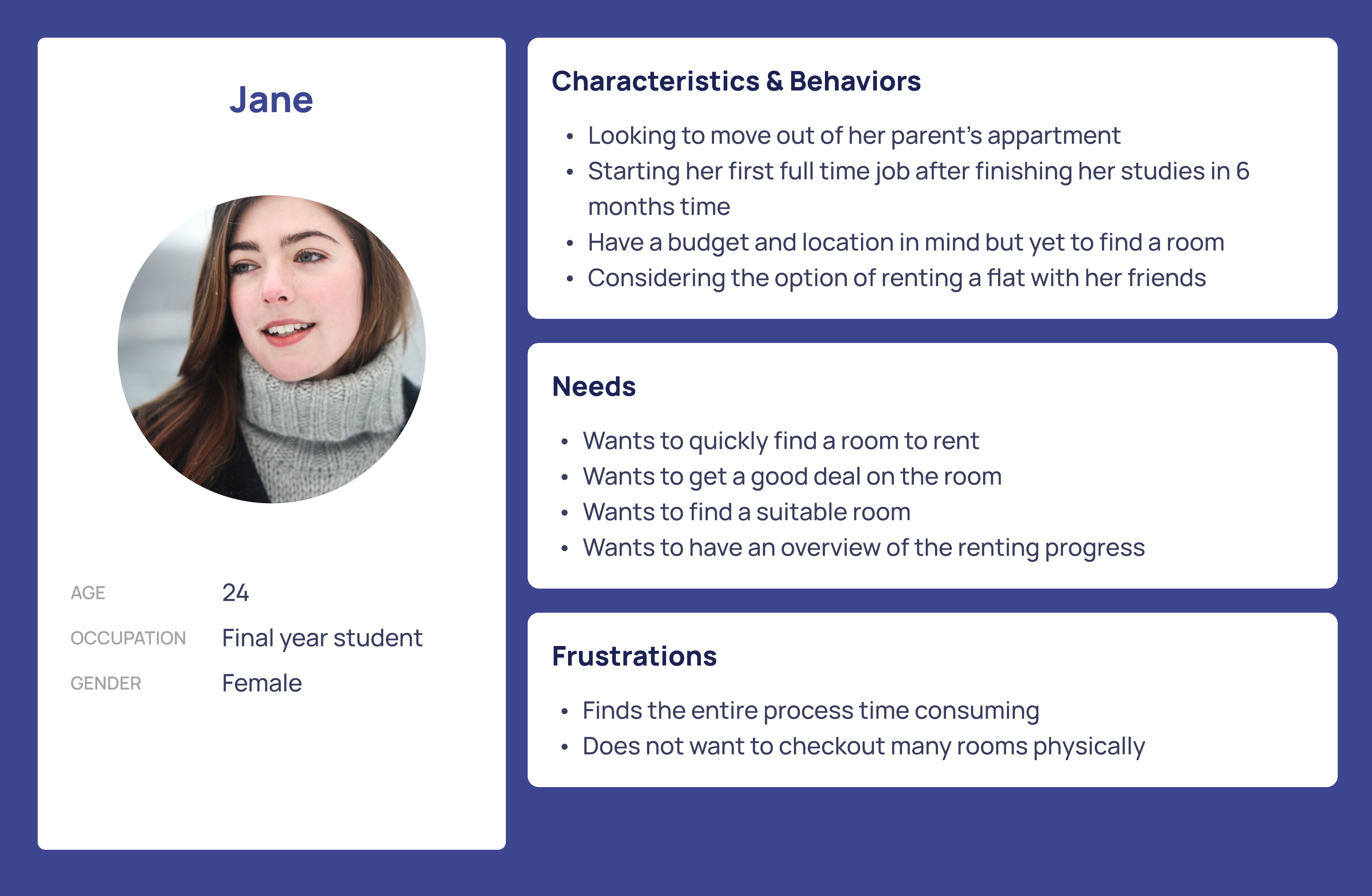
User Persona
User Interview
To help prepare for initial rounds of user interview, I have listed some guiding questions below to identify problems and validate assumptions:
- What are the tools and technologies that you use to find a room?
- What are the some of the typical needs on the room you are looking for?
- How long do you expect to take to find a room?
- How do you usually liaise with the owners of the room you are looking for?
- What are your thoughts on the process of finding a room?
User Findings
I have summarized my findings from the initial interviews as follows.
Pain points
- Existing applications have too much advertisements that makes it difficult to look at the relevant information posted by home owners
- Not sure of the type and status of the other tenants in the flat (if any)
- Want to know about the convenience of the flat (e.g. nearby shops, restaurants, etc)
- Want to know about the pricing and payment options
Some exising applications/tools for finding room
- propertyguru
- wechat/whatsapp/telegram groups
- online forums
Most wanted features
- a way to bookmark rooms and organize them into lists
- a way to check available and timing of room tours
- a way to easily procure related services such as house moving, house cleaning, etc
Primary User Goals
From the interviews and the initial research, the three primary user goals my product should achieve are:
- Help users take control of the apartment hunting process
- Expedite the process of finding a room
- Secure the most suitable room for the user
Prototyping
During wireframing, I realized that there are some complexities that need to be addressed. In particular, the "search parameters", or the critical information about a room, can be quite complicated. Below I listed out a few of the key parameters that I would like to include in the search/room information display. To aid the design process, I also listed out some potential user flows that the application should support.
Search parameters
- Price
- Location
- MRT
- School
- Town
- Offices
- Type of room
- Shared room
- Single bedroom
- Master bedroom
- Studio
- Entire flat
- Type of rental
- Long-term
- Short-term
- Time of posting
- Type of amenities
- Aircon
- Washing Machine
- TV
- Table
- Wifi
- Wardrobe
- Type of facilities(nearby)
- Swimming pool
- Supermarket
- Stadium
- Shopping mall
- Restrictions
- Pets
- Cooking
- Visitor
- Others
User Flows
Wireframes
Time for the real design work!
In total, I have created two wireframes of the application in Figma. They are embedded below under "Wireframe 1 & Wireframe 2". In each tab, I have also included some discussion of the user testing(and the results) done.
The very basic lofi prototype is viewable at this link. Note that I did not link up all the buttons and the text fields as I intended to make this just enough for the very first round of user interviews.
With the basic wireframe W1, I decided to conduct a formative evaluation to ensure that the application is going towards the right direction. The first interview is done with a protential user over a Zoom meeting, in which she manipulated the prototype to achieve the task of finding a room. Below are some of the pointers taken during the testing.
On the search screen, the user clicked on a room in the search results and found the popup near the bottom of the screen to be small and difficult to interact with. The user was confused with the star icon on the left corner and did not understand it to be the button to save a room. The user wondered about the wording "2 hrs ago" that was displayed on top. The user thought that the information about time that the room was posted was not relevant/important.
- Action Items:
- The popup could be centered and make the other information less distracting so that the user can focus on that particular room.
- Have a tooltip or use a more relevant icon for the "save room" functionality.
- Reorganize information displayed on the popup to make it more relevant.
- Action Items:
On the room full-details screen, the user was not sure whether the photos can be enlarged or scrollable. The user also was unsure why there is a "copy contact" button, which seems less useful than the rest of the options. The user clicked on the chat button and wondered if the chat functionality could be natively supported by the application.
- Action Items:
- The photos could be displayed in a carousel or include a scroll bar.
- Consider removing the "copy contact" button.
- Consider adding a chat interface.
- Action Items:
On the home screen, the user was confused by the text "feed" on the top left. The user was not sure how to manipulate the pinning of search keywords.
- Action Items:
- Find a better placement of the text.
- Make the search interface more intuitive.
- Action Items:
On the saved screen, the user questioned that why only saved rooms can be compared. The user was wondering what if she wants to compare the rooms back in the search screen.The user was also confused about the purpose of the saved screen since it mainly does comparison. However, the user was pleased that the comparison feature exists and commented that other applications do not have such feature.
- Action Items:
- Make "compare" available on other screens.
- Make the saved feature more functional.
- Consider moving the saved rooms to a better location, maybe as part of settings
- Action Items:
On the progress screen, the user was not sure if she needs to be told about which stage she was in. The user found the screen irrevelant.
- Action Items:
- Re-consider the usefulness of the progress screen.
- Action Items:
The second wireframe is a slight modification of W1. The wireframe screens can be seen in this figma link. To gather more thoughts, I have interviewed one more potential user and noted down some observations/feedback as follows:
- In general, the functionalies of the application were satisfactory.
- In the login screen, the user was unsure about the login method and questioned about why there was no Email login option.
- Action Items:
- Consider adding an Email login option.
- Consider making it clearer that the default login is via mobile number.
- Action Items:
- In the home screen, the user was not sure the category of the rooms displayed (whether it's All, or a specific category).
- Action Items:
- Make sure the category selected is obvious.
- Action Items:
- In terms of search, the user wondered if there is a way to group rooms based on the MRT stations nearby. The user also wondered if she can sort different categories.
- Action Items:
- Consider adding a filter to group rooms based on MRT.
- Consider adding per category sorting.
- Action Items:
- In the progress screen, the user was not sure about the different stages and what they mean. For example, what is the "enter needs" stage and how to enter needs. The user also suggested about including helpful materials under each stage. These will serve as a guide for users who may not be familiar with the renting proceess in Singapore.
- Action Items:
- Re-consider the meaning of the stages.
- Re-consider the layout of the progress screen.
- Re-consider the functionalities of each stage.
- Consider adding helpful materials.
- Action Items:
- In the search screen, it was not clear how the user could enter the room details page.
- Action Items:
- Make a button for navigating to the room details.
- Action Items:
- In the room details page, the user was not sure the communication would be done with an agent who posted the room details or the landlord. The user was not sure if a room can allow price negotiation.
- Action Items:
- Make sure it is clear who posted the room.
- Indicate whether the room allows price negotiation.
- Action Items:
- The user suggested exploring the idea of having reviews on rooms.
Interactive Prototypes
With all the feedback collected for the wireframes, I moved on to create interactive prototypes in Figma. In total, I have created two prototypes of the application to put all the design elements into place. I have also made some noticeable modifications that I would like to highhlight.
Shift in focus
Initially, I have included a set of screens that are meant for the housing agents/landlords who would like to post room details. I decided to remove them in the prototype to focus on the user who is looking for a room. However, some user intractions are still in place to make the user flow complete. This includes the following:
- A user will be able to indiciate whether he/she is currently "looking for a room" or "renting a room". This will subsequently determine the application interface they see (which the housing agent/landlord view has been omitted).
- A user will be able to chat with the housing agent/landlord.
Along the same vein, I decided to remove the ability for users to browse the application without logging in. This is because I feel that the user flow gets confusing when the user who is not logged in tries to access the other screens of the application. Instead of the convenience of having an option to browse the rooms without login, I decided to keep the interface and user flow standard, and make it more useful for login users (ability to save and chat with the room owner).
Updates in functionalities
Comparison feature
Initially, I was under the impression that it would be extremely helpful to have a table like comparison tool to help users compare the rooms. This draws inspiration from comparison/benchmarking websites for PC components. However, as I explore the UI for the search screen, I feel that a separate comparison is somewhat redundant. This is because when the users are searching for a room, they are in fact performing comparison, with the help of filters and sorting criteria. Having a separate comparison tool is less useful because the additional steps required to pick and choose the rooms, and also unpick and go back to room exploration.With further feedback from user testing, I have decided to remove the comparison feature.
Progress feature
Initially, I included a fancy progress page to show the user's journey in the room finding process. This feature while able to give user an indication of where they are in this process, it was not very meaningful. Instead of removing it, I have decided to repurpose it into a help page that provide users with the tools and resources based on their current stage.
- If they are just browing: a price indicator graph is provided for user to get a general idea of the price range of the rooms. They are able to tweak the parameters so that the price shown reflects the room requirements.
- If they are now in talks with the housing agent/landlord: a number of helpful materials are provided to help them understand the process and what to take note of.
- If they are now ready to secure their room: a number of legal materials/contract samples are provided to help them understand the process and agreement.
Chat feature
Initially, I have the impression that users may want to use native chat applications such as "WhatsAPP", "Telegram", or even direct message, to communicate with the housing agent/landlord. However, I discovered that most people would like to have all the functionality, including the chat feature, in the application. This is so that once they are settled with all the information they need, they can simply proceed offline to finish the process. Thus, I have added a chat screen such that users can talk to the agent/landlord directly.
Room posting/details
Initially, the rectangluar room tile used in the home page and the search page was not very comprehensive and space efficient. With the amount of information that users may want to immediately acquire, I have decided to re-organize the room tile (and the room details page) to use descriptive icons and bold text to make the information more readable.
- Now, the user can easily see if a posting consists of how many rooms (and toilets), whether it is posted by an agent or a landlard etc, all without entering the room details page.
Miscellaneous
I have also updated some minor details in the application. For example, to allow users to easily save and chat, I have included the "heart" and "chat" icons for each room tile such that the navigation is very convenient.
Prototype 1 & 2
Prototype 1 is the first version of the interactive application. It addressed some of the points mentioned above and was then used for user testing. Prototype 2 is the final version of the interactive application. It covers additional points/improvements discovered during the testing of prototype 1.
In addition, I have reviewed the Design principles (Shneiderman’s 8 Golden rules, in particualr) and make adjustments to the application to make it more user friendly. For example:
- Keep users in control
- The bottom navigation bar is almost always present to allow users to navigate to the five important screens in the application
- Backward navigation is provided in some cases to provide a way to navigate back from inner context to the main screens
- Tabs have been used to allow for lateral navigation
- Reduce short-term memory load
- The rectangular tile representing the posting information is designed to keep the essential information of a room, without minimal cluttering. Important information such as the pricing, room type and location are included while less important information is hidden and discoverable when user clicks into the posting.
Conclusion
The complete interactive prototype is available here (also embeded in the above second tab). The Figma design file is available here.
Credits:
- Icons from Feather icons, and Figma plugin iconify
- Stock images from Unsplash, and Figma plugin Unsplash
In summary, this exploratory design exercise has provided me with a good opportunity to practice interaction design.
I learned about:
- How to use Figma to create wireframes and prototypes
- How to gather requirements and define user tasks
- How to conduct user testing and interpret the results
- How to apply design principles to create a user-friendly application